

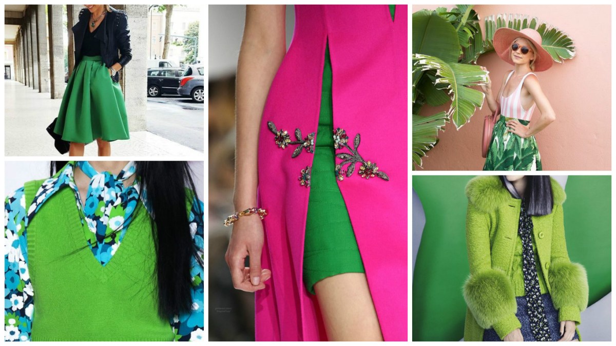
Greenery é um tom refrescante e revitalizante, símbolo de novos começos. O tom fresco e verde-amarelado evoca os primeiros dias da primavera, quando a natureza revive,se restaura e renova.
Greenery é natureza neutra. Quanto mais submersos estiverem na vida moderna, maior será o seu desejo inato de mergulhar na beleza e na unidade do mundo natural.É um tom que afirma a vida, Greenery também é emblemática da busca de paixões pessoais e vitalidade.
Uma seleção de cor simbólica; Um instantâneo de cor do que vemos acontecendo em nossa cultura global que serve como uma expressão de um humor e uma atitude.

 GREENERY – PANTONE 15-0343
A refreshing and revitalizing shade, Greenery is symbolic of new beginnings.
Greenery is a fresh and zesty yellow-green shade that evokes the first days of spring when nature’s greens revive, restore and renew. Illustrative of flourishing foliage and the lushness of the great outdoors, the fortifying attributes of Greenery signals consumers to take a deep breath, oxygenate and reinvigorate.
Greenery is nature’s neutral. The more submerged people are in modern life, the greater their innate craving to immerse themselves in the physical beauty and inherent unity of the natural world. This shift is reflected by the proliferation of all things expressive of Greenery in daily lives through urban planning, architecture, lifestyle and design choices globally. A constant on the periphery, Greenery is now being pulled to the forefront – it is an omnipresent hue around the world.
A life-affirming shade, Greenery is also emblematic of the pursuit of personal passions and vitality.
What is the PANTONE Color of the Year? A symbolic color selection; a color snapshot of what we see taking place in our global culture that serves as an expression of a mood and an attitude.
Pantone is an institute that works with the standardization of colors and choosing a color for the year influences choices in the fashion world, decoration, among others.
The choice of the color is studied in advance by experts from various areas and together find a consensus.
Although personally I find a color somewhat difficult to apply in fashion (not everyone looks good in a yellow-green shade, isn’t it?), the concept behind the choice fits perfectly for the year that we will face ahead!
Surely 2017 will be a year of renewals and hope, after all, who did not feel exhausted in 2016?
Of course there is no way to compare Rose Quartz and Serenity Blue – which were the colors of 2016 and we loved it – but with some combinations it is possible to look fashionable and beautiful!
After some research I think I am gonna the a risk in Greenery!
